Powerful Logo designs
In computer landscape, all industries work hard to be the best in the pace. They concentrate on many things which help them to attain that place. As designing matters a lot to them high priority is given for designing a logo for their brand name. Millions of dollar is spent for creating and redesigning that “Logo”. The logo is recognized as the face of any company so to create it, a pleasant impression and eye catching visual identity is must. The top IT companies and their powerful logo designs is getting stupendous every time.
List of companies and their logo:
1. Apple:
This U.S based top IT Company where its logo speaks about itself. Originally it was multi-colored then changed to two colored in year 1999. Symbolically represents a great design and stands for its brand company name. It represents the tree of knowledge.
2. Microsoft:
![]()
This is Microsoft’s present logo which they started using in year 2012. Before this three different logo designs were used. They were almost same with different slogans as “Where do you want to go today?”, “Your potential. Our passion”, “Be what’s next”. The present logo symbolizes the world of motion and its distinct product range
3. IBM:
IBM’s initial logo was globe then in year 1947 it started using acronym-based one. Currently using eight bar logo is simple, recognizable and influential too. The blue 8 bar line means whole world is in it and white lines represents equality.
4. Google:
Beauty is in simplicity Google proves this by its logo. It’s simple, attractive and versatile too. Using different colors to show we can search almost everything from nothing.
5. Intel:
Intel changed this logo in year 2005. The light blue color used to create an impression of dominance of its country. The motto is to take lead in the future. Circle around it highlights a better marketing plan to lead them ahead with more velocity
6. Cisco:
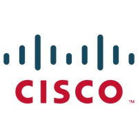
This logo is really interesting. Several modifications have been done before this present on. This is redesigned one in year 1996. Made like name is smaller than the bridge so that bridge gets prominent look. Red and blue colors have been used where red stands for prosperity, prominence and calmness whereas blue shows determination, passion and business responsibility.
7. Oracle :
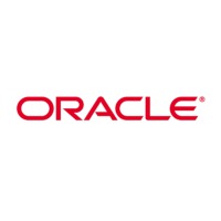
This has been created using only one primary color in very simple yet influential manner. It’s visually appealing with handwritten typography look. One of most recognized logo red color depicts energy, passion, determination and excitement.
8. SAP:
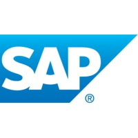
Using blue and white colors to it logo gives a dynamic look. Bright blue color gives the impression of power, determination, excellence, innovation and better coming results from company by focusing on digital market.
9. Facebook:
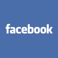
Being one of the top social networking sites its simple and appealing to users. From the start of company small changes has been done to its logo. With blue background and white fonts signifies youth color creating calm and cool sensibility.